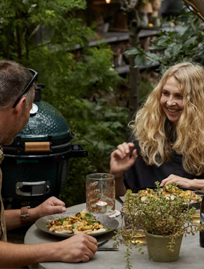
TREND WATCH
Colour Drenching
Transform your pad through paint and colour, and create spaces that boost your mood,
creativity and promote harmony.
Transform your pad through paint and colour, and create spaces that boost your mood, creativity and promote harmony.
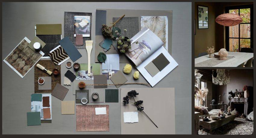
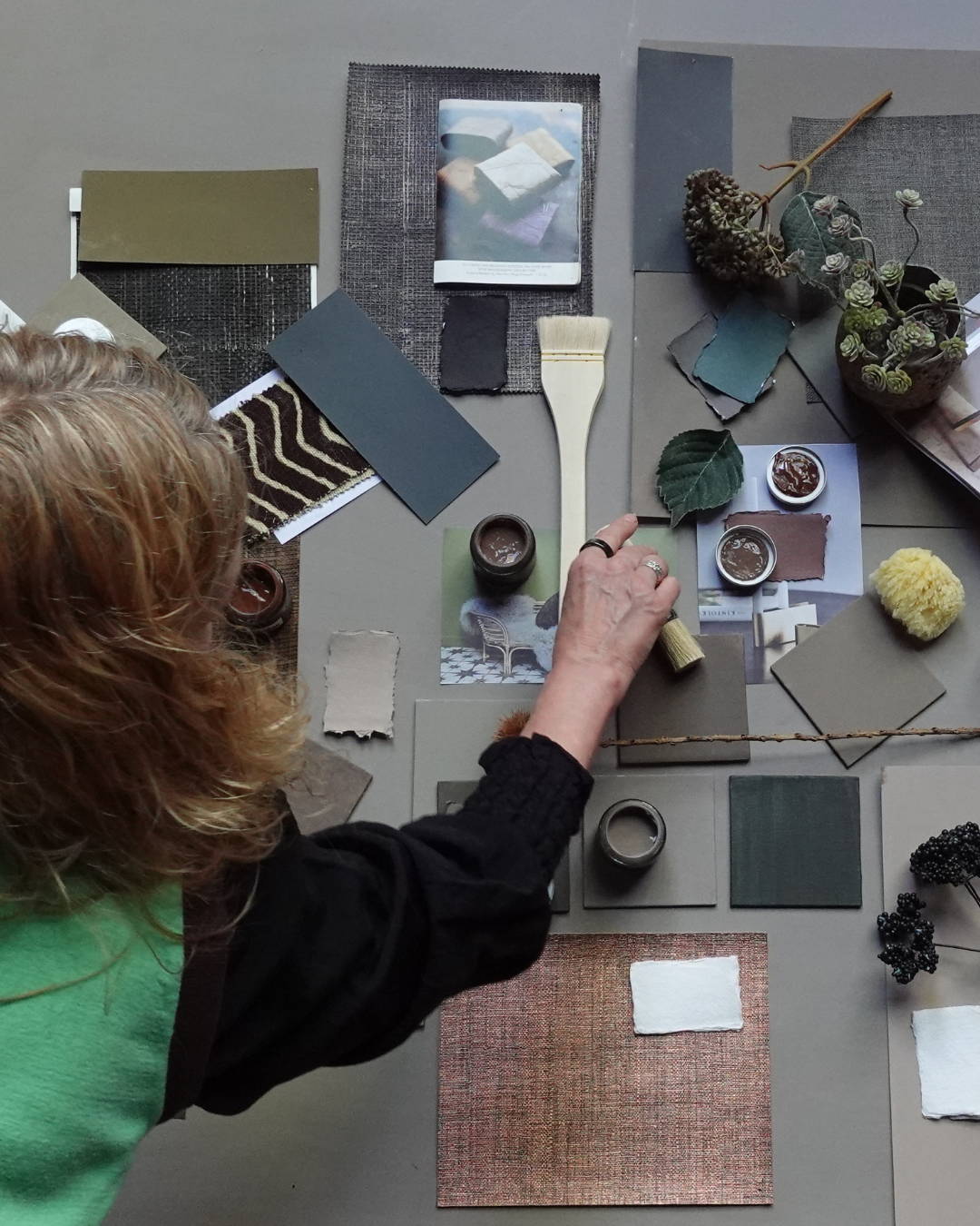
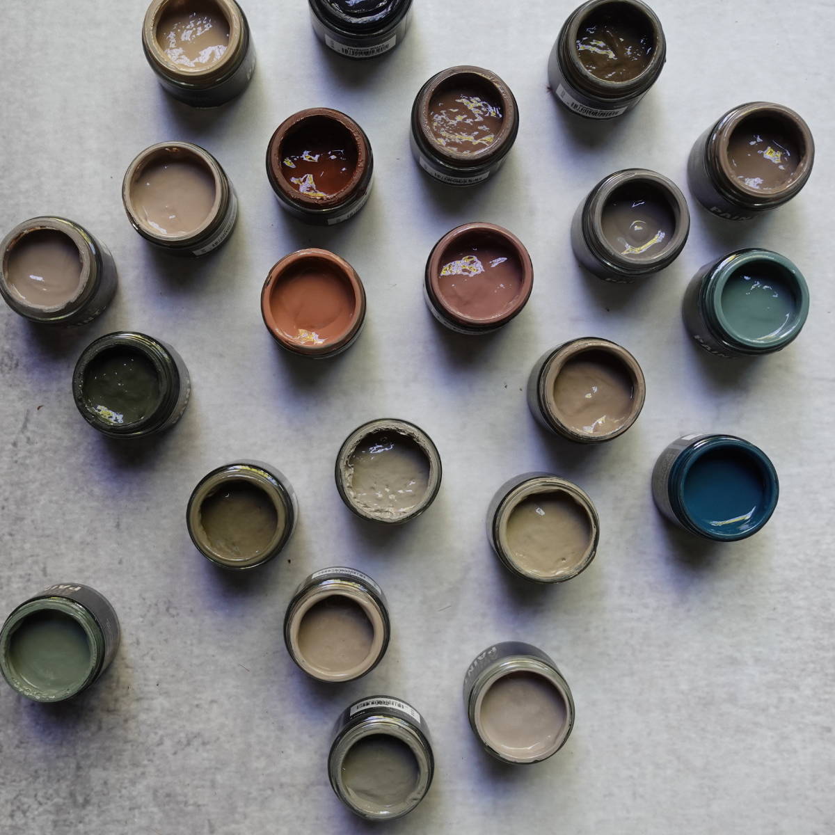
Have You Seen The New Abigail Ahern Paint Collection?

We've had a colour makeover and we're taking it to the next level, inspired by and in celebration of our beautiful landscape. We’ve obsessed over creating a cosy cocooning colour palette in which to unwind. Imbued in natural warmth these luxurious hues are perfect for fostering an environment you never want to leave.
Have You Seen The New Abigail Ahern Paint Collection?
We've had a colour makeover and we're taking it to the next level, inspired by and in celebration of our beautiful landscape. We’ve obsessed over creating a cosy cocooning colour palette in which to unwind. Imbued in natural warmth these luxurious hues are perfect for fostering an environment you never want to leave.
“ Colour can turn the simplest abode into an edgy, sophisticated den in which to hunker down. There is simply no quicker or cheaper way of transforming a space.”
Abi x
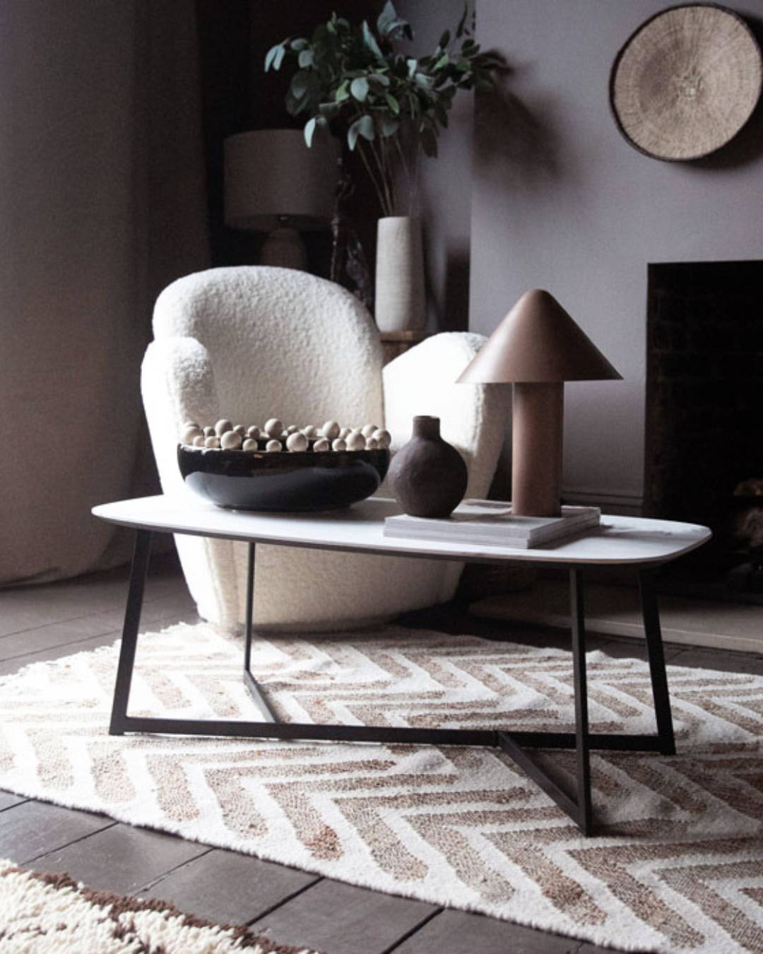
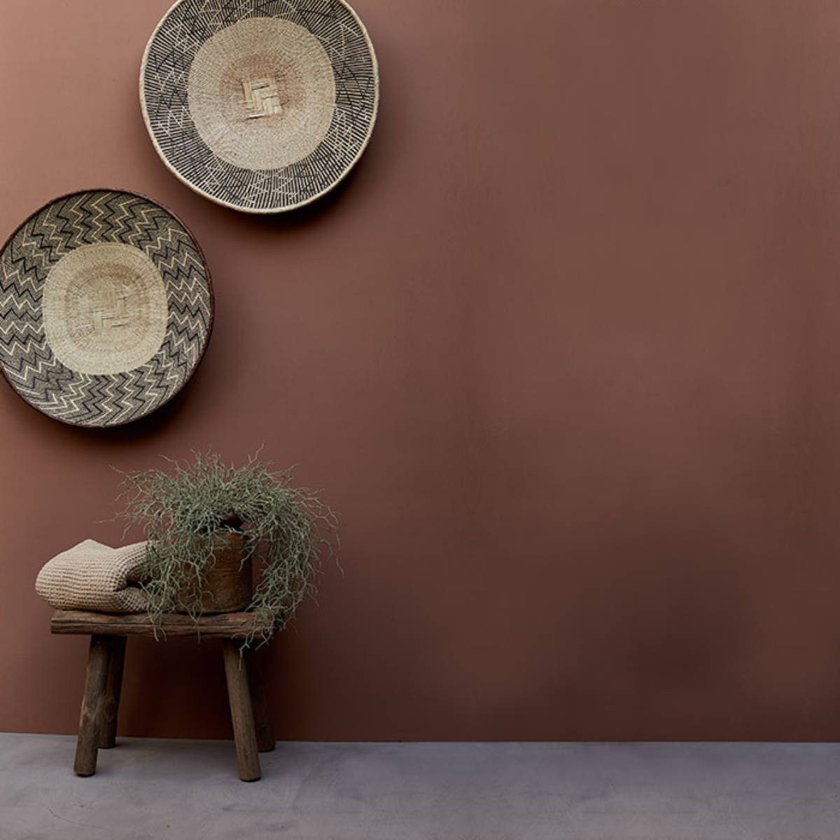
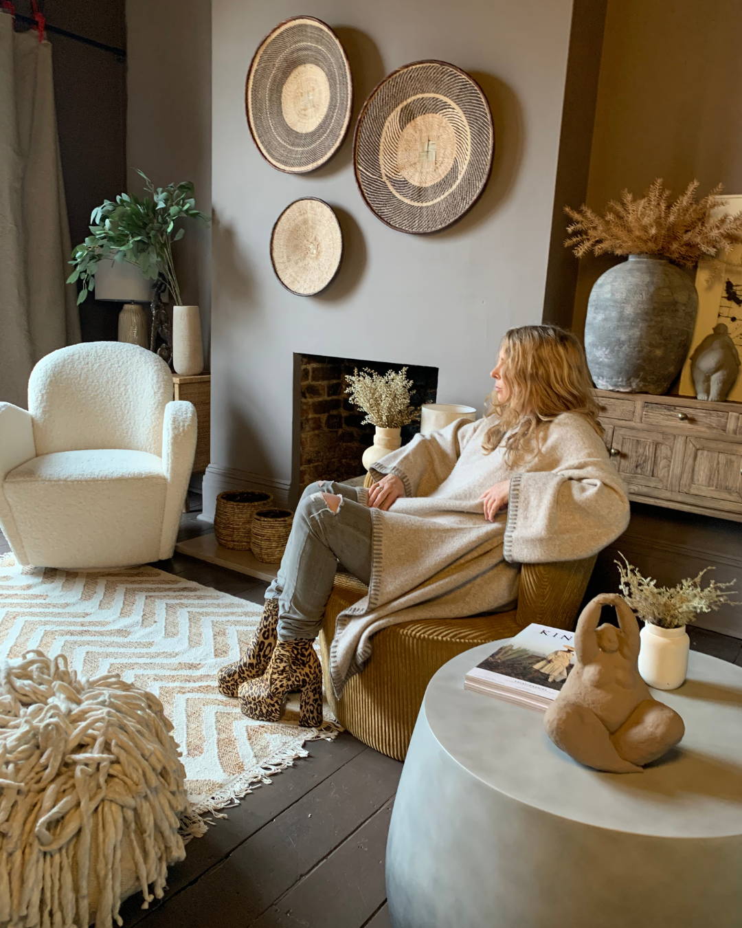
Abi's studio painted in Drizzle
Abi's bedroom with walls, floor and ceiling all painted in Crosby
What is colour drenching?
It's about taking a fabulous hue and using it everywhere - walls, ceiling, radiators, doors etc. Using this method of decorating creates the perfect backdrop to your furnishings and decor and blurs the boundaries between the walls and the ceiling, disguising any stark lines and making your room feel more larger, cohesive, sophisticated and stylish.
Abi's studio painted in Drizzle
Putty Paint
Outback Paint
Baked Clay Paint
Smudge Paint
Abi's bedroom with walls, floor and ceiling all painted in Crosby
“Colour is the most transformative thing you do can do to a space if you want to add some emotional content to your pad. It changes faceless rooms into spectacular rooms. It can be bold, blingy and fabulous and soft.”
Abi x
Abi's top 3 tips for colour drenching
1. Painting the ceiling and walls the same colour.
"Often the biggest hurdle, but one you will NOT regret. Pushing the colour all the way around the room like this, enveloping it in your chosen shade, elongates the space especially if you’re working with a small room and an earthy colour."
2. Painting the skirting boards the same colour as the walls.
"Painting the skirting boards the same colour as the wall allows it to seamlessly blend into the floor, even if your floor is not the same colour, the boundaries are blurred."
3. Should I paint the radiators the same colour as the walls?
"Yes indeed, no need to highlight something as practical (and sometimes ugly) as a radiator. Let it blend into the background so that your eye isn't immediately drawn to it. There are some exceptions to this rule, as there are now an increasing choice of radiators that are a design statement in their own right, but if you have the normal metal wall hung type, I would always paint them out in the same hue to disguise them."
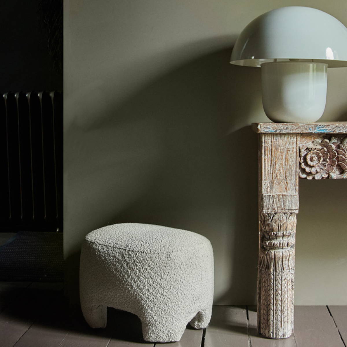
“ One of the amazing things about colour drenching is that the walls and ceilings effectively disappear and become an amazing backdrop to all of your interesting furnishings and decor.”
Abi x
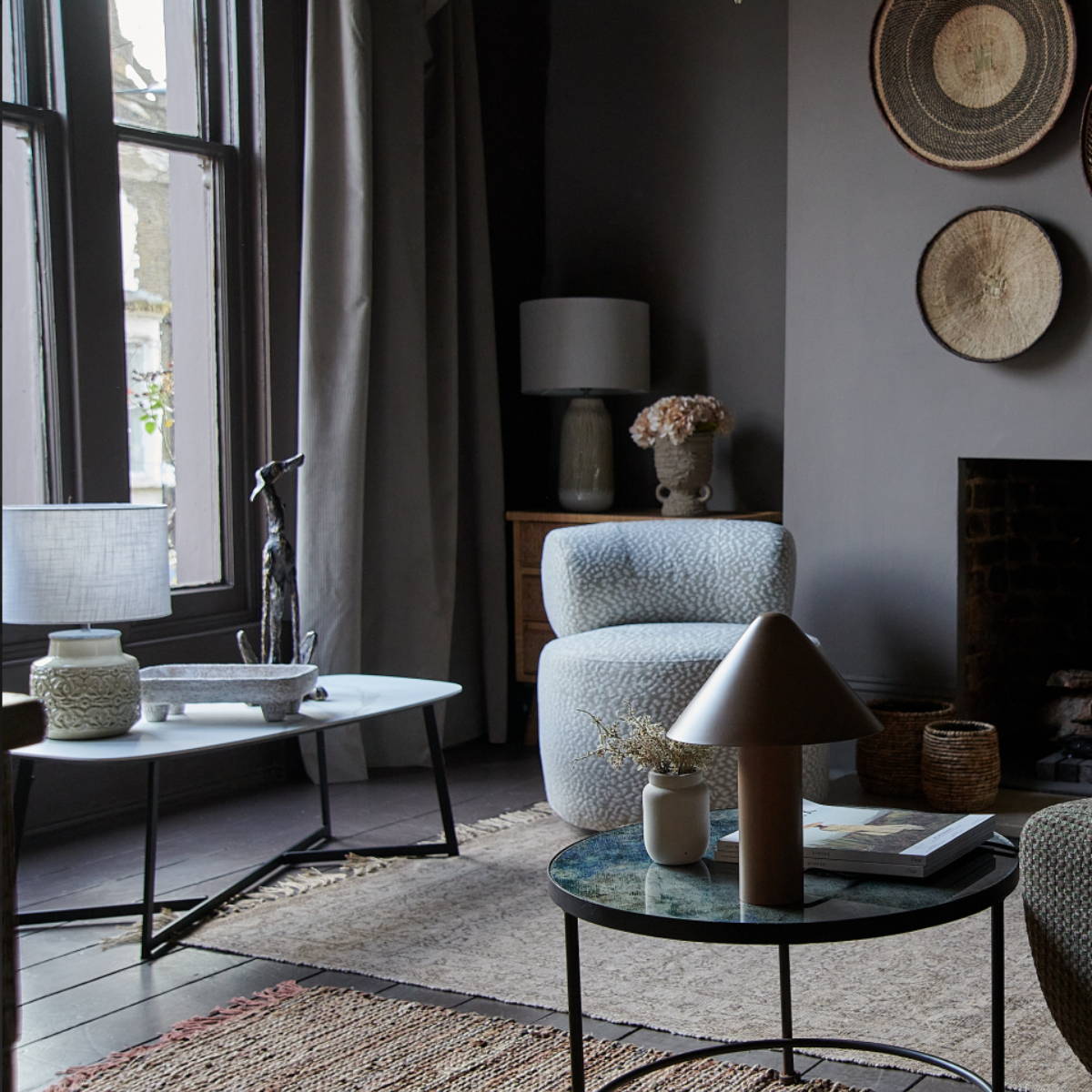
Abi's studio
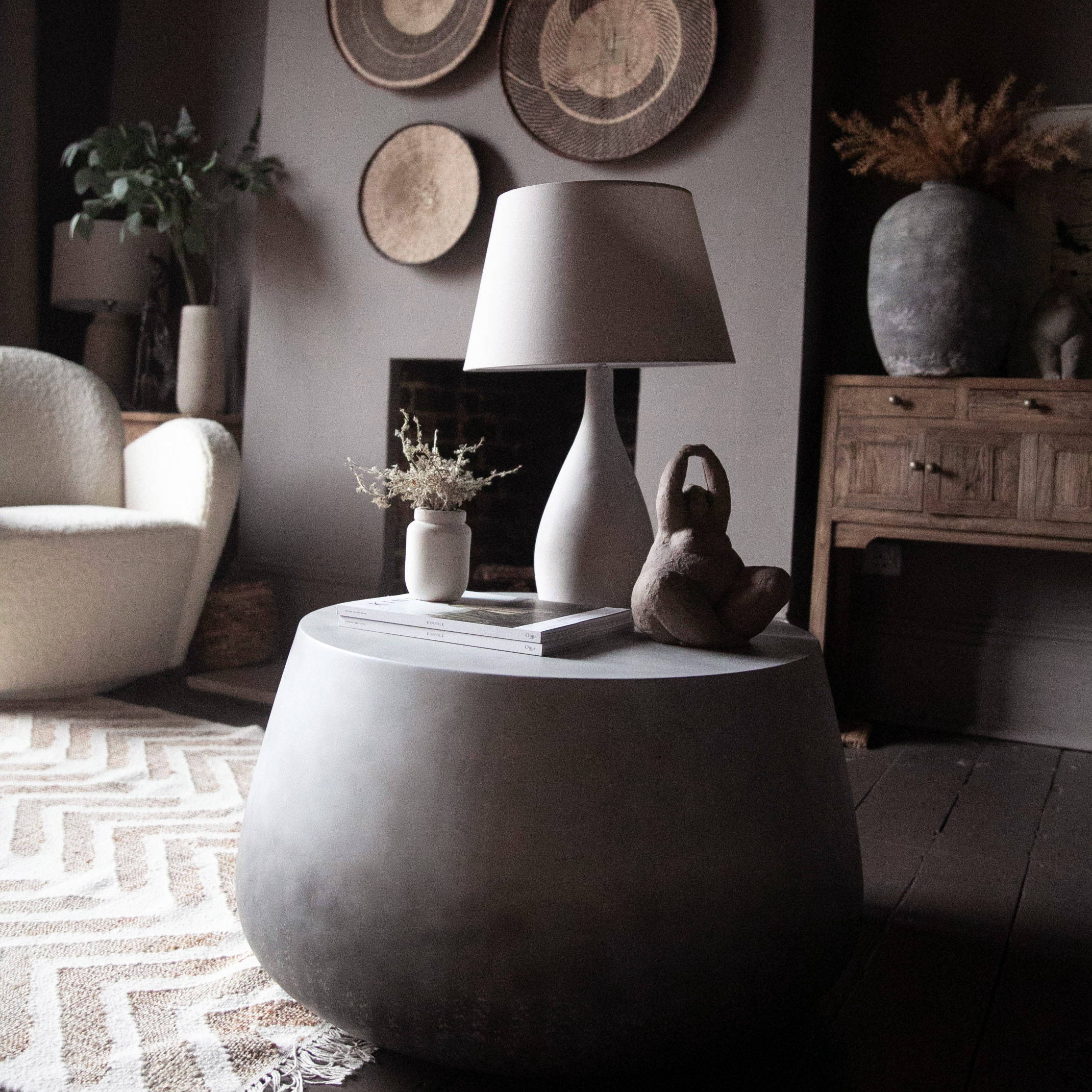
Abi's studio painted in Drizzle
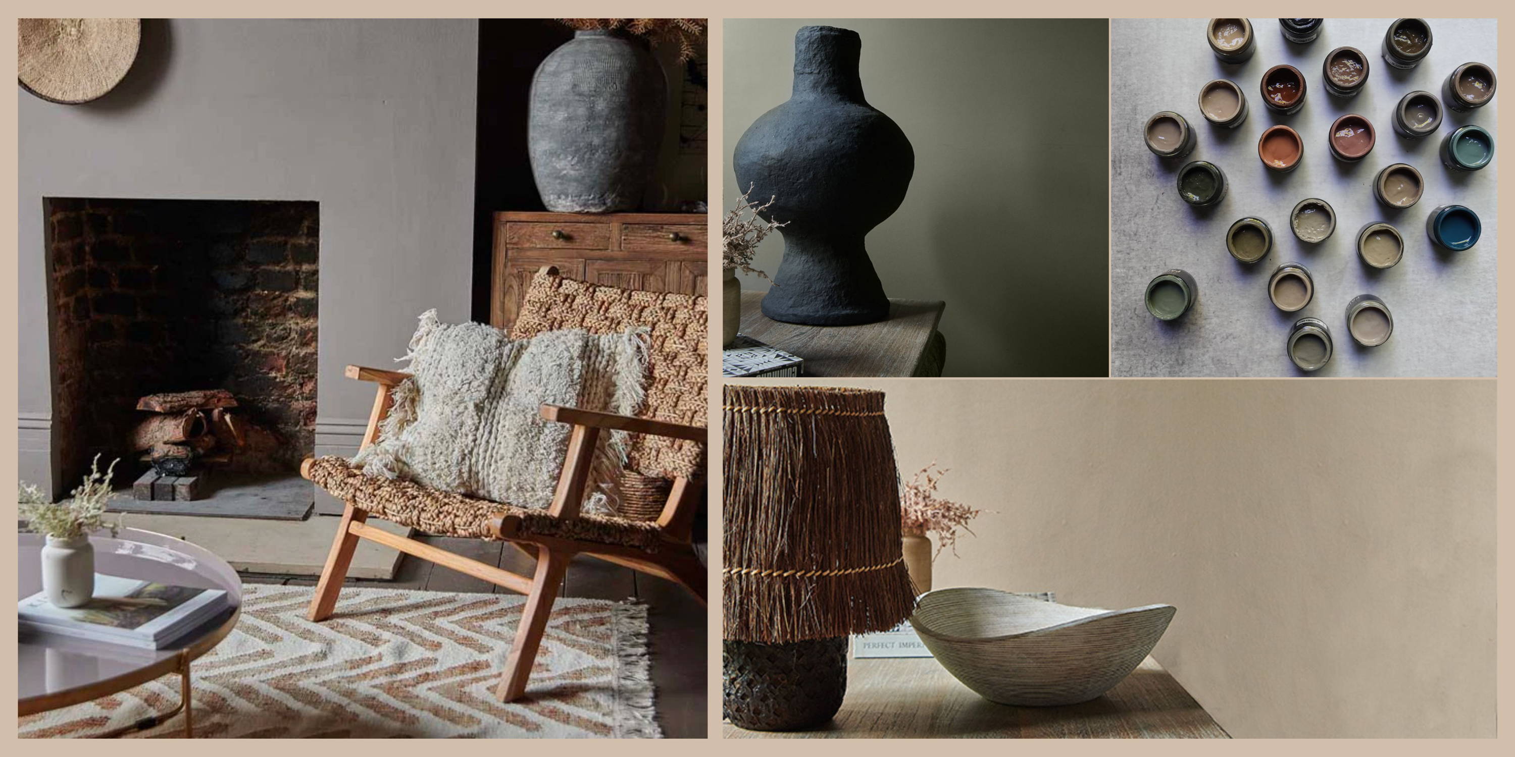
Why do interior designers use colour drenching?
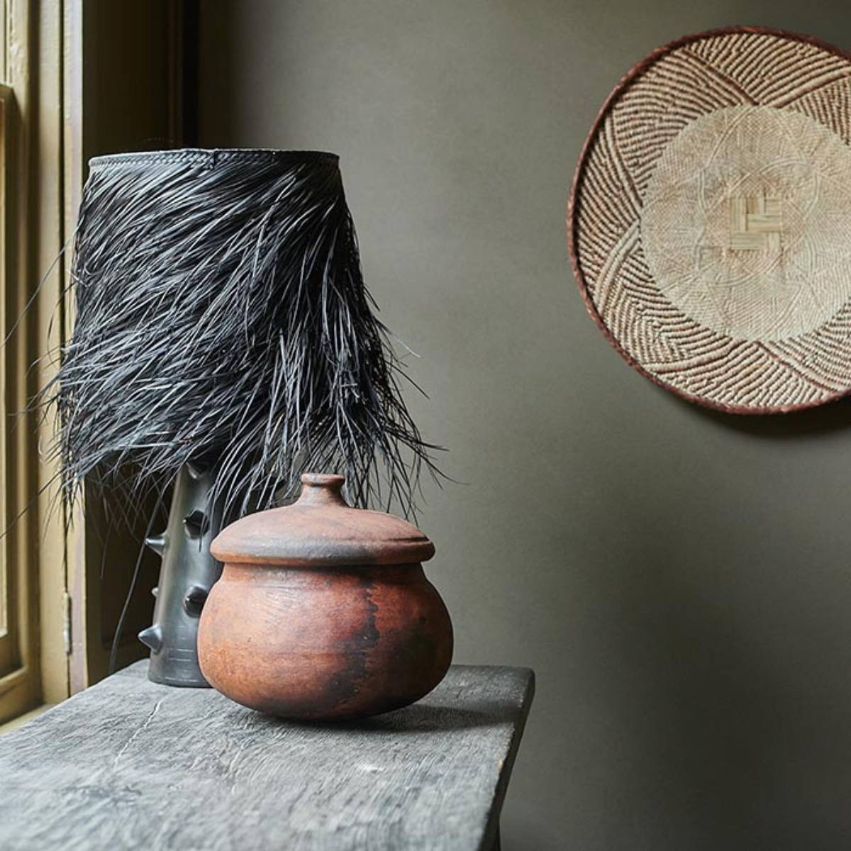
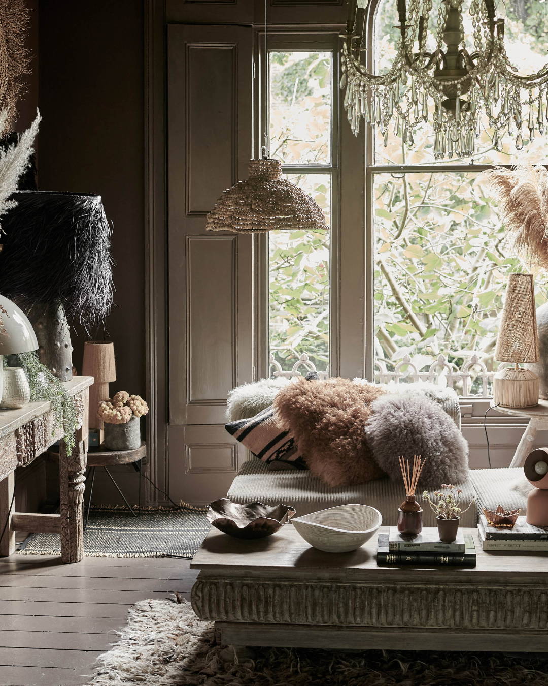
A statement lamp, textured cushions, vignettes, coffee tables can all become the star of the show because they're not competing with the colour on your walls. Your eye is not competing with the boundaries of your room dimensions and instead can comfortably settle and enjoy the oodles of personality that your furnishings and decor inject into the space.

Abi's studio painted in Drizzle

Vera Sculpture

Kodiak Table Lamp
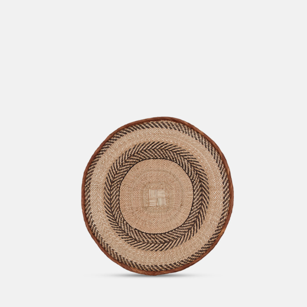
Arcola Wall Basket
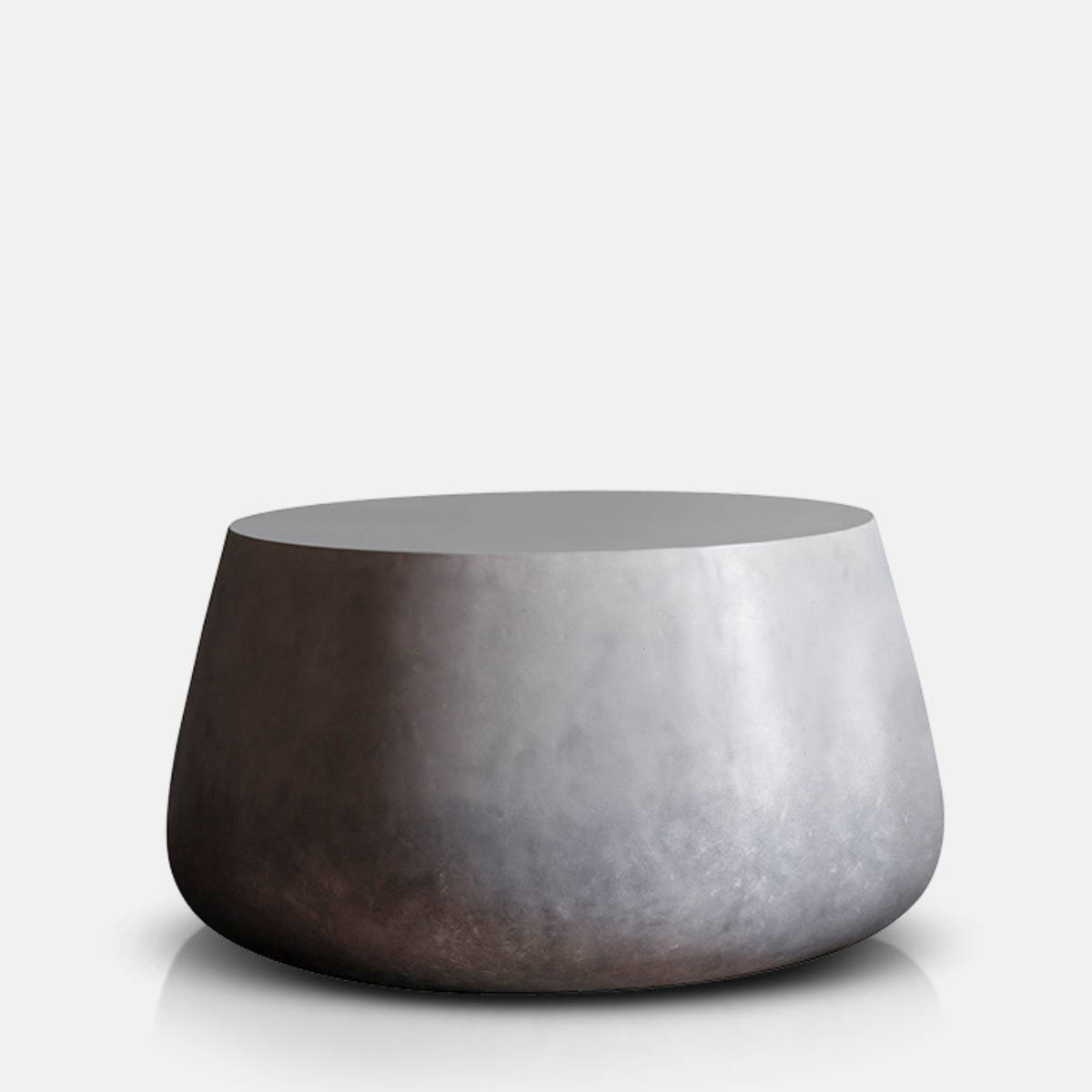
Holmes Coffee Table
Shop our Inspired Collection
Our paint collection of earthy saturated hues has been inspired by nature. Made from mostly natural pigments, they give redolence and depth so you get beautiful undertones with the colours subtly changing with the light. Take a look at our sumptuous palette of earthy and wild tones for inspiration.
Abi's Final Thoughts on
Colour Drenching
Abi's Final Thoughts on
Colour Drenching
"Trust your heart"
“When you paint out your walls, ceiling, skirting boards and radiators in the same colour, the whole backdrop recedes and any objects from chandeliers to cushions and bed linen, just takes more of a central role. Choosing a colour that you love is essential. You need to consider how you want the room to feel and then work from there, having confidence in your own style means that you will create a home that YOU love. A home that oozes your personality but most of all a home that makes you feel exactly how you want it to. So throw away the rule book, forget trends and trust your heart."
Want More?
From stories to inspire to products that support joyful living our AA community is a place you can learn, connect with like mind people and build a home you never want to leave.
Home
AA Live
Our Story
Read