
Emulsion is a flat matte paint with no sheen and should be used to paint your walls and ceilings. Eggshell has a slight sheen but is more durable, so it should be used to paint all of your trims including window frames, skirting boards, door frames and radiators. Eggshell can be used on walls too. It's perfect for high traffic areas like hallways and bathrooms and can add a contrasting design element to your scheme if you want to create extra intrigue with textures especially when you use the same hue.
The Journal
Stories, Notations, Discoveries

HOME STYLE
Creating a whole house colour scheme.
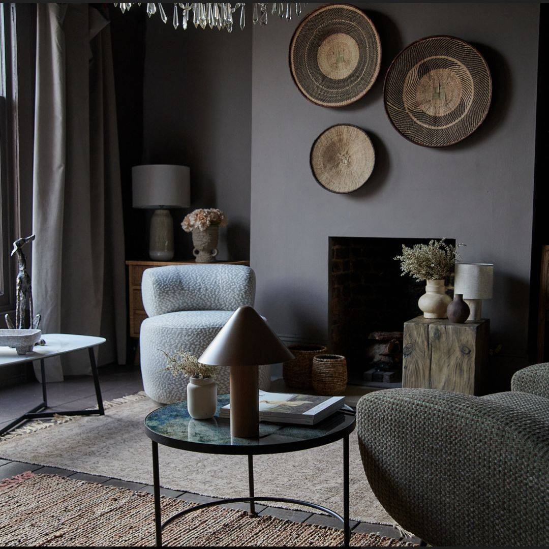
Creating a cohesive colour palette throughout your home is such an important decorative tool, unifying your space whilst allowing each room to have to its own personality for diversity, continuity and flow.
Creating a cohesive colour palette throughout your home is such an important decorative tool, unifying your space whilst allowing each room to have to its own personality for diversity, continuity and flow.
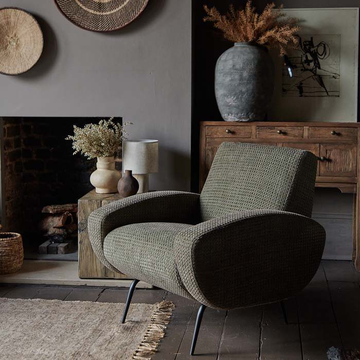
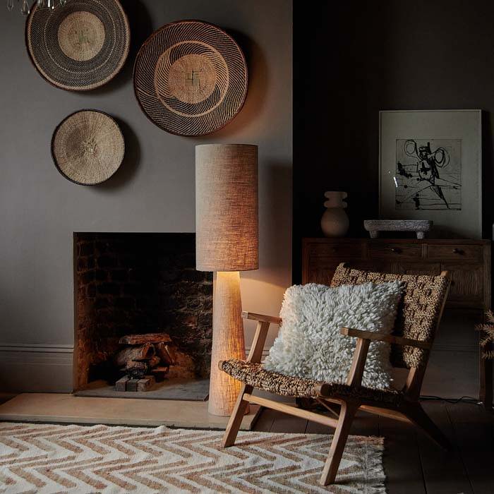
Our beautiful collection of muted earthy tones, from mid to swampy and dark have all been designed to work alongside each other.
Finding your Inspiration
Create a Moodboard

Gather up images of any house crushes you have from magazines, pinterest etc. Look to hotels or restaurants that you admire, anything that just makes your heartbeat a little faster and that you feel a connection with. Before long, a common thread will start to appear, giving you a starting point for a decorative scheme.

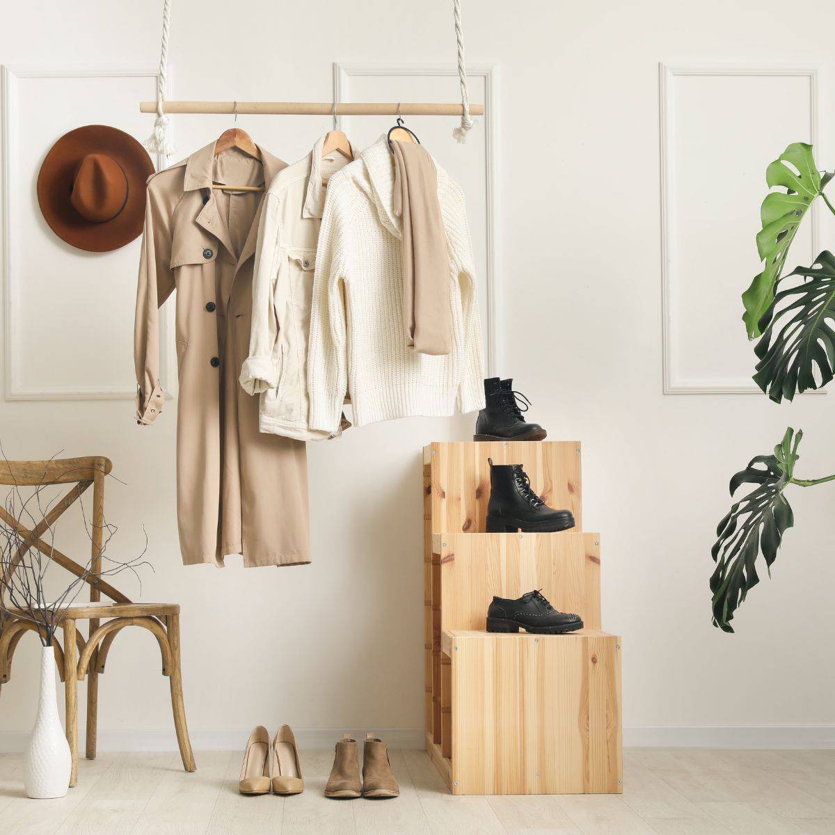
Look to your Wardrobe
Look at the things you have in your home already from clothes in your wardrobe to a large piece of art or rug. You obviously already love those hues so think about reflecting them more.

Take a look around you.
Be inspired by your environment, vegetation, landscapes, seascapes, the city, walks in the park, local flower market, some graffiti on a bridge.
You’ll be amazed at the options when you open your eyes.


Whatever your style, you need to think of your pad in its totality. All the rooms connect so the design and decor should seamlessly flow. You could repeat a colour in a different way in different rooms and use a similar colour palette throughout.
How to Choose your Paint Colours
Top Tip: Choose the room that you frequent the most as a start point for your whole house scheme.
How many colours do I need for a whole house?
Pick a family of colours, we generally advise between 6-8 colours throughout the whole house no matter how many rooms you have. Add in graduated tones in different strengths as this will provide you with a seamless colour journey from room to room. For example AA has used Madison Grey, Pickle, Hudson Black, Crosby, Kelp, Smudge & Bedford Brown in her pad and layered in both neutral tones and accessories with some inkier darker pieces which ground the whole palette and make it feel super sophisticated.
Creating flow around your home
When you link hallways and landings and powder rooms, cloak rooms and mud rooms into your whole house colour scheme, you will create such a beautiful harmonious thread of hues that will have a fabulously cohesive feel. Every room will flow continuously, a favourite trick of some of the world’s coolest interior designers.
Finishing Touches
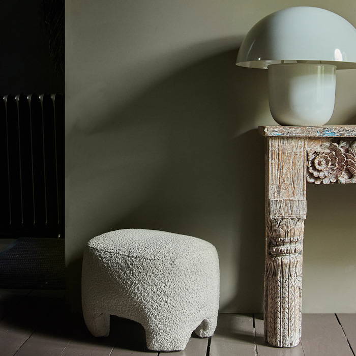
All colour schemes are improved by accents, the final touches of colour that add an element of surprise, and bring rooms to life. There are no fixed rules when it comes to choosing these, just take care with the amount of colour you use and where you use it. The effect changes again once you add lighting, pattern, texture and greenery into the mix.
Creating flow around your home
When you link hallways and landings and powder rooms, cloak rooms and mud rooms into your whole house colour scheme, you will create such a beautiful harmonious thread of hues that will have a fabulously cohesive feel. Every room will flow continuously, a favourite trick of some of the world’s coolest interior designers.

"I always design each and every space in my own house around a mood or emotion. I continually ask myself how I want to feel in each room. Your decorating choices totally affect your emotions and how you feel in a space, the colour on your walls can make you feel relaxed or if you don’t get it quite right, anxious."
Abi
x
Welcome to our beautiful palette of superior water-based paints.
From swampy hues to summery grasslands to winter forests and even the colour of the earth after a downpour these hues have all been inspired from nurturing landscapes. Blurring the lines between inside and out these stunning hues offer up a beautiful combination of colours that provide a sense of warmth, comfort and security. Carefully selected pigments crafted from minerals and resins that have been chosen for their qualities of density, durability and opacity.
Discover the full collection
Discover Pendant Lights and Chandeliers
Welcome to our beautiful palette of superior water-based paints.
From swampy hues to summery grasslands to winter forests and even the colour of the earth after a downpour these hues have all been inspired from nurturing landscapes. Blurring the lines between inside and out these stunning hues offer up a beautiful combination of colours that provide a sense of warmth, comfort and security. Carefully selected pigments crafted from minerals and resins that have been chosen for their qualities of density, durability and opacity.
Discover the full collection
How to Paint the AA Way
Do you know your Emulsion from your Eggshell?
Here are just a few of our Frequently Asked Questions when it comes to painting the AA way.
What's the difference between Emulsion and Eggshell?
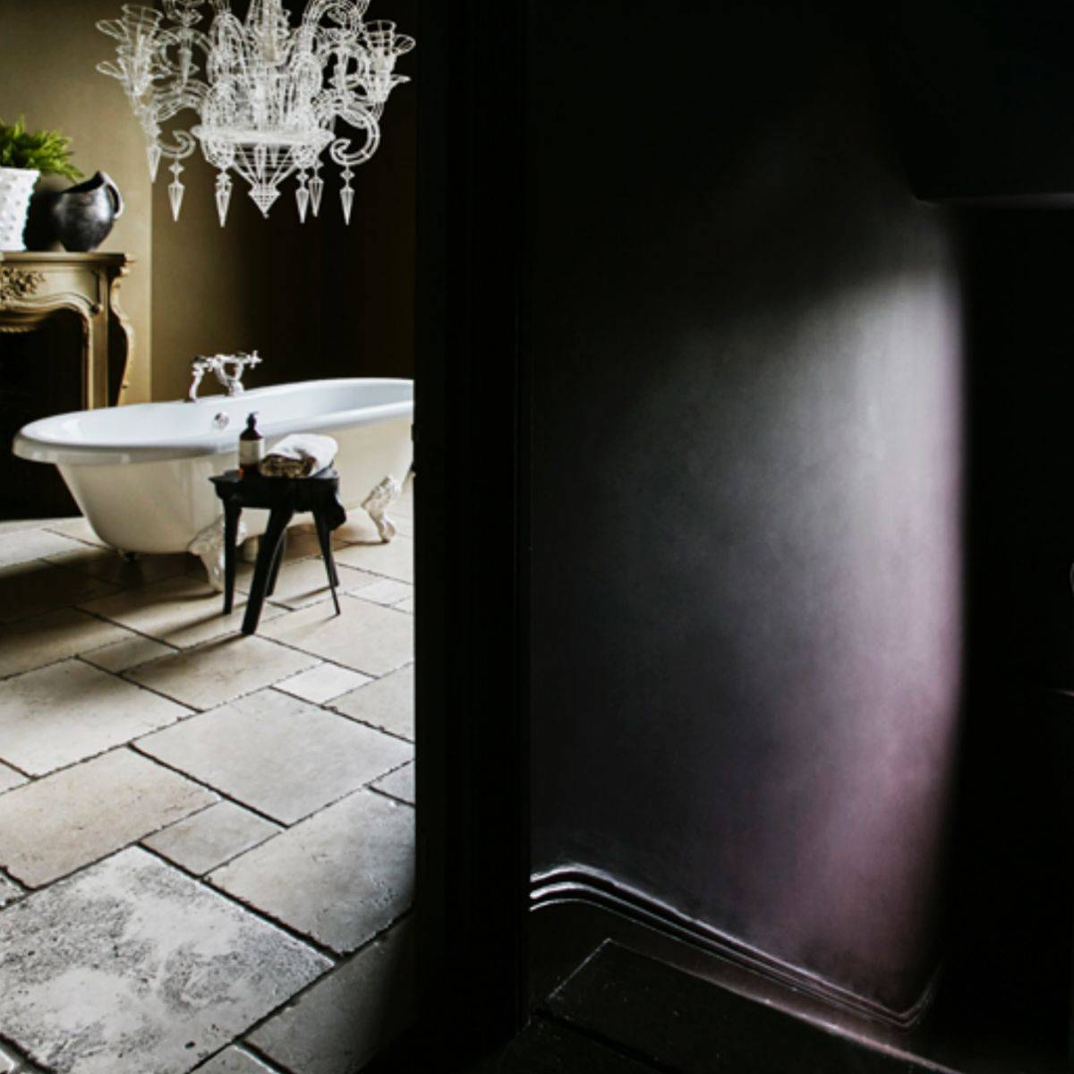
Why should I paint my walls and ceiling the same colour?
When you paint the ceiling out in the same colour as your walls you blur the boundaries and the room feels bigger and creates a seamless transition. If you have a white ceiling you accentuate the boundaries and quite often the lack of height in a room. Pushing the same colour around your whole room creates the perfect backdrop for the rest of your furniture, rugs and accessories. If you are not ready to take the full plunge into colour drenching your whole room, consider painting your ceiling in a slightly lighter tone to your walls, a white ceiling only ever looks good with white walls (if you like that kind of thing of course)!
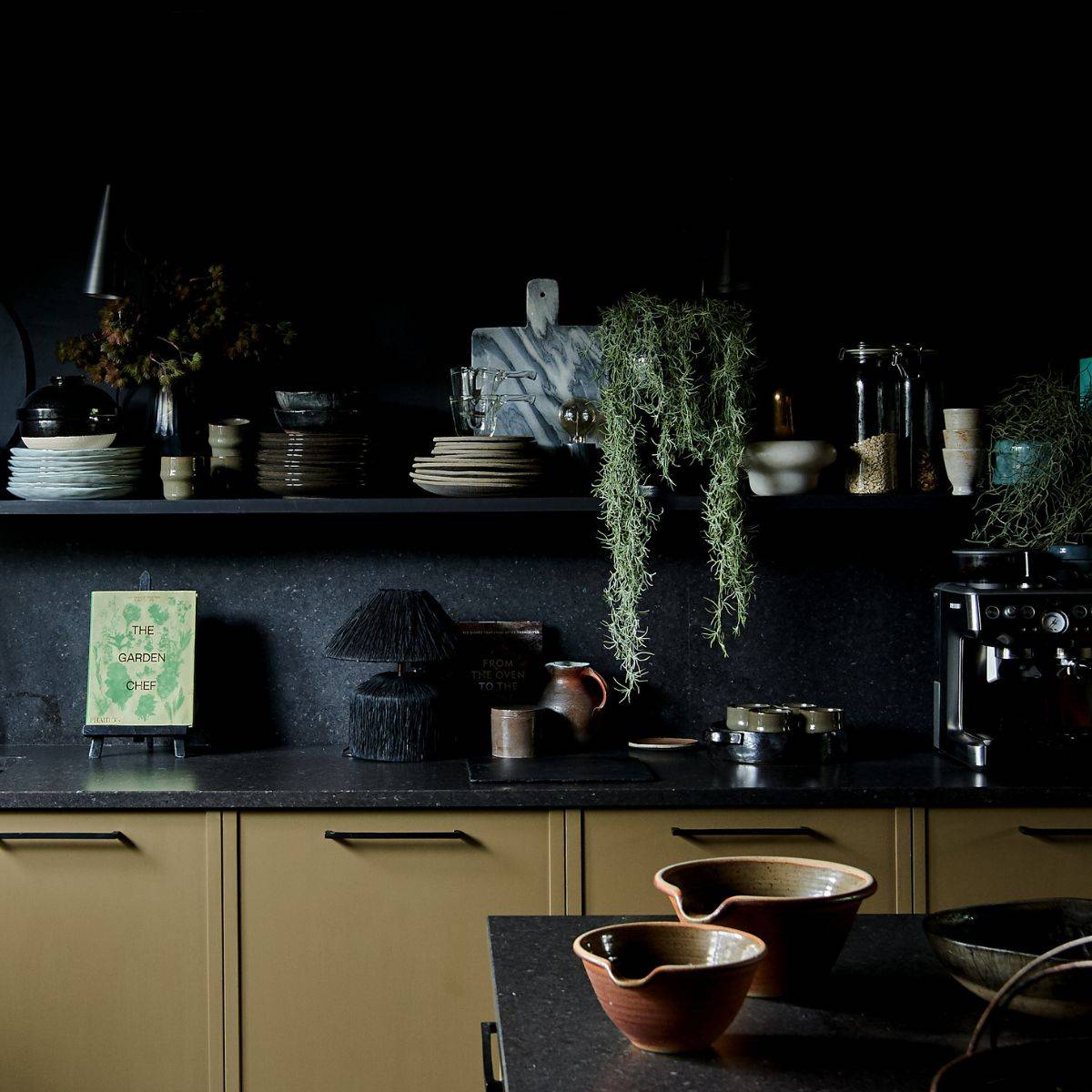
Should I paint my radiator?
It's the AA way to always paint the radiator the same colour as the walls. If your walls are broken up by a big white blob, your eye will automatically be drawn to that and not your beautiful interior space. There are a few exceptions whereby some radiators have a designer look and may already be a cool colour that complements your scheme, but in general they need to be disguised not highlighted.
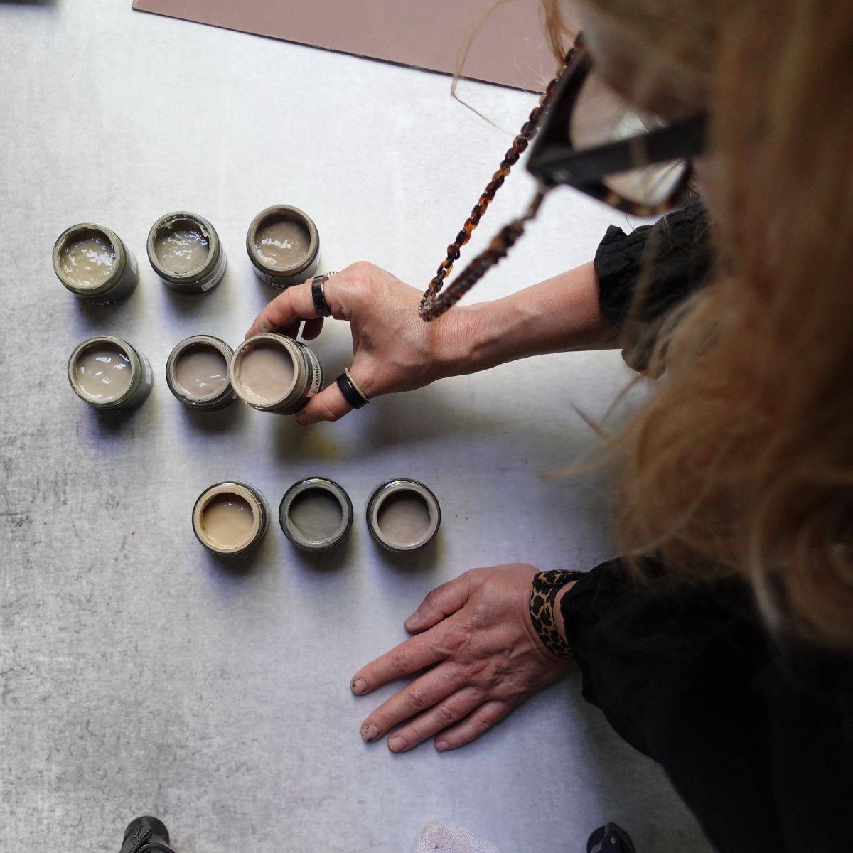
How should I test paint colours?
Always buy sample pots before you decide on your colour palette and make your decision after you’ve painted the largest area you can. Swatch cards are too generally small to provide a good enough reference point so you need to take the plunge and paint a wall or at least half a wall. If this is not a favourable option for you, then paint the largest sample you can on a large piece of card or lining paper (which is relatively cheap). Tape it to your wall and make sure you look at your sample throughout the day to see how it looks and feels when the light changes. It helps to keep it there for several days/weeks to really get the feel of your considered hue.
Are feature walls a good idea?
The interior design world can be very snooty about feature walls, and while I prefer to paint our my whole space in one colour, I'm not totally adverse to championing this 90's trend. Feature walls are a good way to add contrast and personality but you just need to ensure that you echo the same hues in the rest of your room by way of accessories or soft furnishings such as cushions or throws to create a cohesive feel. That way you will create a feature wall that not only looks amazing but makes sense within your space as whole.
What's your best piece of decorating advice?
People don’t often decorate in a cool fashion because they are scared they will fail. Don’t be scared and face the fear of making mistakes, it will guide you on all sorts of incredible journeys. When you decorate differently and break boundaries, it becomes addictive. It’s easy to play it safe, but the trouble with taking the safe route is that it doesn’t allow you to inject personality into your home. Just remember to take it slow. Decorating isn't like fashion, you can’t simply take back a kitchen because you don’t like it, so don’t rush into things, take your time and enjoy the journey.
Need more Inspo? - we think you'll love these.

Pinterest Board
My Home Style
for more inspiring dreamy home decor.
Read the Journal
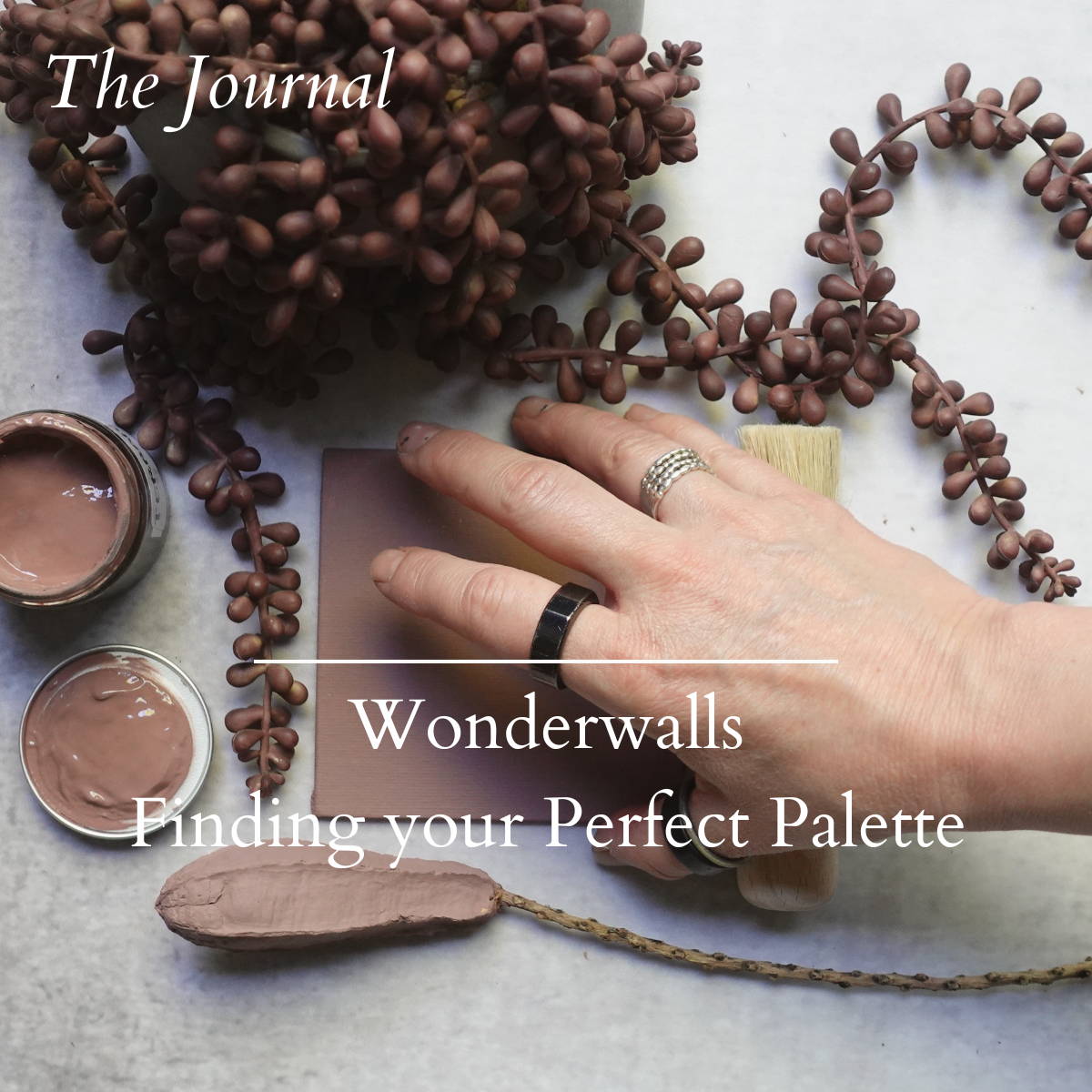
Wonderwalls
on how to find your own perfect paint palette.

Pinterest Board
Paint Collection for more inspiring images from our paint collection.
Read the Journal
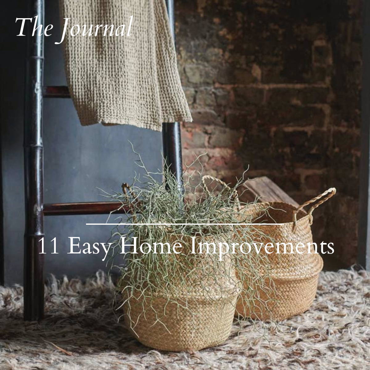
Easy Home Improvements
for more some inspiring ideas to tweak your home for the better.