
So now you’ve taken the quiz to suss out your style (and if you haven’t done it, hotfoot it over there now! I’ll wait.), I’m going to drill down into each of the styles. Gorgeous real-life inspirational examples, quick fixes you can do to your own place, and favourite pieces for every look etc. I thought we’d kick off with classic, as that’s what I got when I did the quiz myself. Kind of surprising even to me, but the more I thought about it the more it made sense…
THE VIBE
If you’re bored of passing fads, classic style never goes out of date. This look can be super traditional or beautifully relaxed, but everything should stand the test of time. So maybe it’s a favourite art piece, a bygone chandelier, a well loved old Chesterfield and an elegant runner. This look is quite formal but it’s still relaxed, calm and all about that understated elegance.
In my own pad I think I’m probably most “classic” in style in my studio (pic above). As my decorating style has evolved I’ve come closer and closer to a style that I could sum up as traditional with a twist… so while there’s still oddball pieces and plenty of glam and drama, overall I want my rooms to exude a sense of balance and completeness. Make sense?

THE DECOR
Frankly, I think no colours are off the table for any of these decorating styles. Colour is so personal and instinctive that I’m not going to say only use browns for traditional, only greens for boho, only purple for glam etc… If you want to paint out your classic room in a bright teal then go for it I say! However it is more about how you combine colours that give the effect… for instance, I think the tightly restrained colour palette is more classic, but the pop of colour approach is much more rock & roll. That’s probably the single biggest way in which my style has changed over the years, and why I’m probably more classic than rocky. Maybe it’s just growing up!!
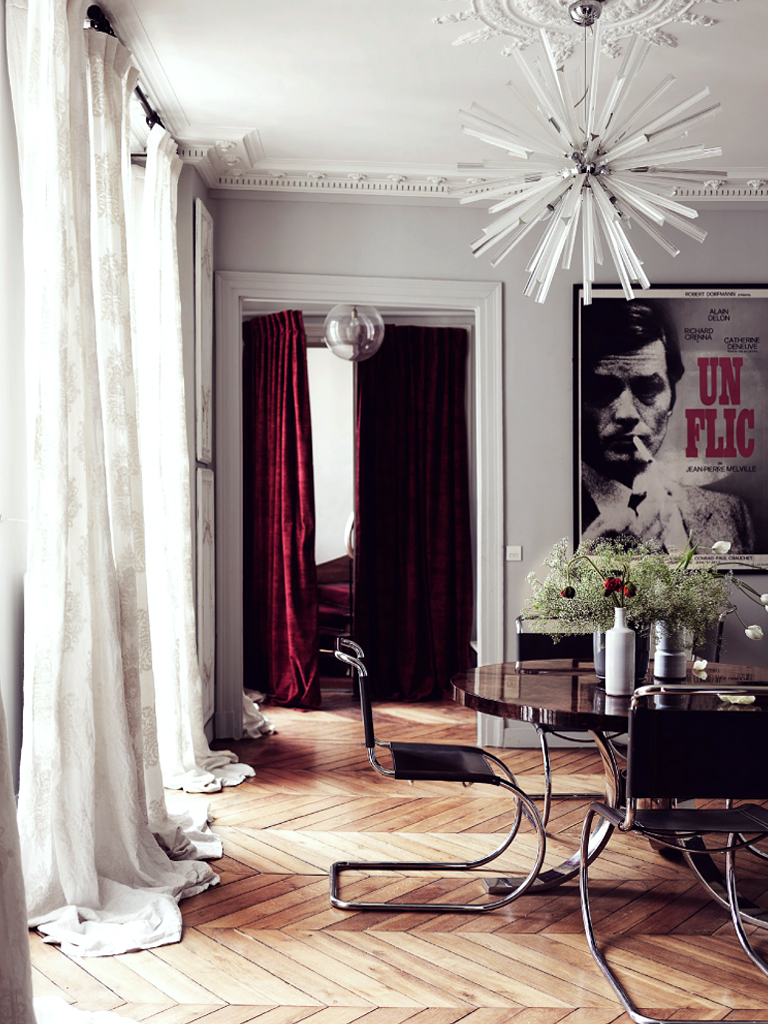
Monochrome schemes will always be fabulous in classic interiors. Of course the AA way to do monochrome is to flip it, using black as your main hue and white as an accent colour. Then you can mix in a third hue – maybe an olive, or a burnt caramel. Basically avoid anything too jarring – a classic room needs to feel harmonious, warm and inviting. So think about this when combining.
If your home has any architectural features, cherish them. My home is a Victorian townhouse, so although I definitely don’t want it to feel like a stuffy museum I get to embrace it’s heritage and plumped for period style fireplaces and cast-iron radiators. Ceiling roses and coving etc add a beautiful accent to any room, as well as oodles of charcter. Even if you don’t live in a period building, think about cheating and adding some simple architectural elements of your own – as Maren did in her hallway. Or even simpler, you can paint faux panelling directly onto walls (there’s a how-to in Decorating with Style).
THE LOOK
Don’t follow the rulebook too strictly with this look as things will become predictable and boring. You always need to add that edge, and mix not match. You need to forget the perfectly symmetrical “hotel suite” look, it’s too stuffy and decorating-by-numbers. From ornate pineapple sconces and beautiful carved mirrors to iconic Fornasetti plates, classic decorative pieces need to look semi-traditional, but there’s no reason you can’t be glam or punky even. Add a little sparkle with chandeliers or wall lights in glass and metallics. Sure we want beautiful and relaxing environments, but we also don’t want to lose those jaw on the floor WOW moments!
FAVOURITE CLASSIC PIECES
 Clockwise from top left: Trenton rug | Ballroom chandelier | Capri bar cart | Dorian convex mirror | Saloon sofa | Harper vase | Lurcher dog | Pineapple wall sconce